Server Stat Display Design
It's like trying to explain how cool a roller coaster is by showing a zoomed inn microscopic view of one of the bolts. We need the big picture.
I have several servers, each with their own purposes, tools and uses. But even if you have just one server, you do need to at least have access to (if not monitor) their vitals such as CPU, RAM, Hard Drive, and Network traffic.
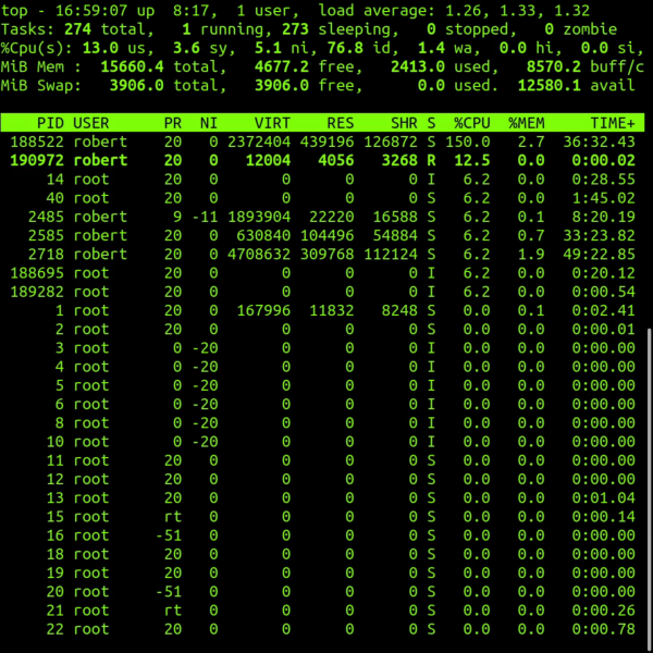
Most servers run on Linux. To monitor stats on Linux using the command line interface the primary tool is called Top. Top is a great tool but it is all textual data. The other issue is a is merely a snapshot, a glimpse in time of a single nanosecond moment. There is no load averaging or big picture view. But the hardest thing for us as humans is trying to visualize all this text, numbers and decimal points. We think in usage and percentages and always need a birds eye view. It's like trying to explain how cool a roller coaster is by showing a zoomed inn microscopic view of one of the bolts. We need the big picture.
So I have spent an hour designing the graphics for my display. I needed a CPU meter, so I went with a speedometer radial style gauge for this. Then I needed RAM or memory, I thought the same style gauge would be good for that metruc. To the hard drive or disk space I often think of disk space as a suitcase that gets stuffed with things, so I thought a vertical gauge would be best for this measurement. When it comes to network traffic for inbound and outbound connections to the server I thought a horizontal meter (like an RF meter on a radio) would be fitting.
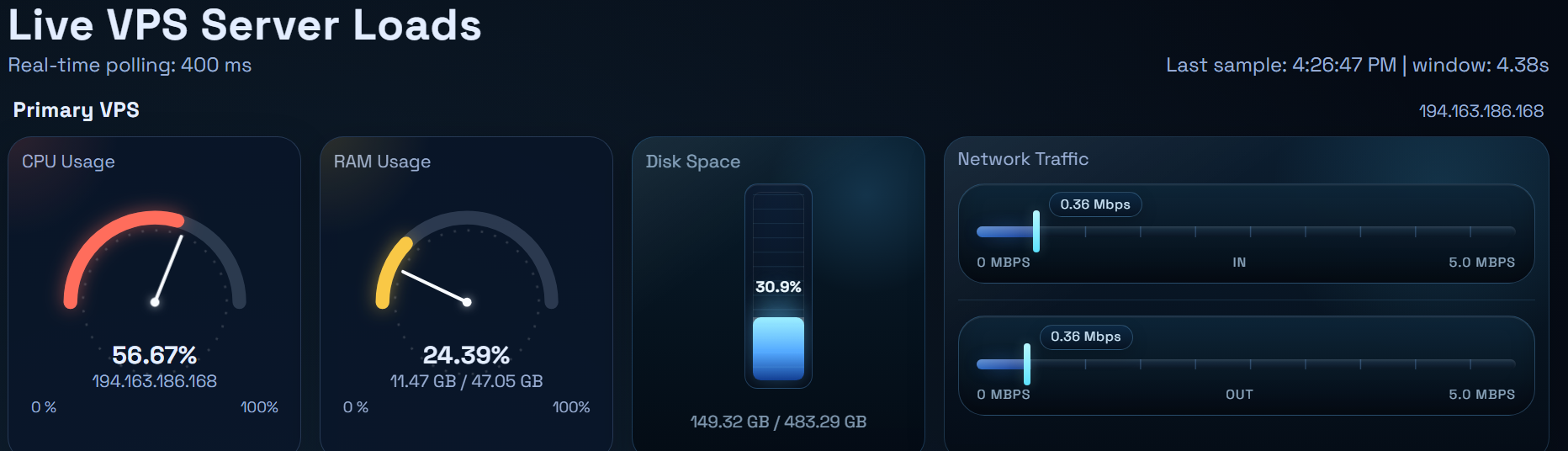
Then I wrote the code to update each and every stat in real time so I always have instant server stats in a visual manner that I can process quickly in my broken human brain. I have multiple panels each just like that on a single webpage, one panel for each server I own. So at a single webpage with one quick look I can instantly determine if any machine is having a problem.
The last thing that I did was created a historical chart for the CPU and RAM usage. The gauges and meters show info in real time, but I needed historical charts to see of if and when I might have had problems or abundant usage in th epast. The historical chart can display the past 30, 4h, 12h and 36h time blocks. In fact, that historical chart is how I discovered that I was hacked!